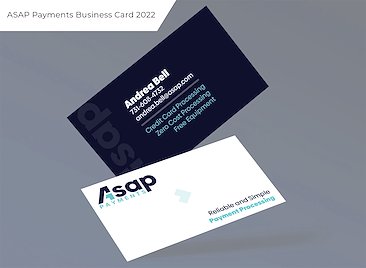
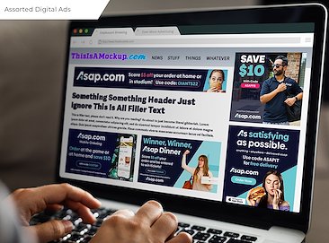
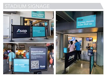
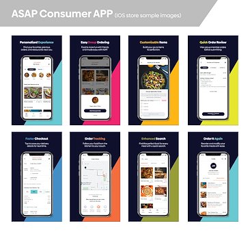
Design By Rachel

ASAP Company

Rebrand

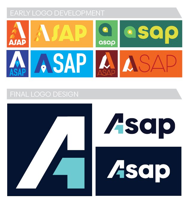
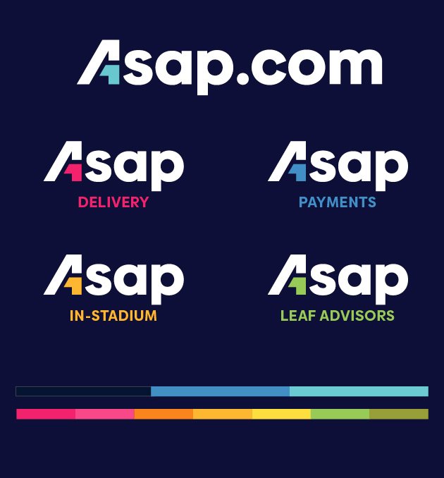
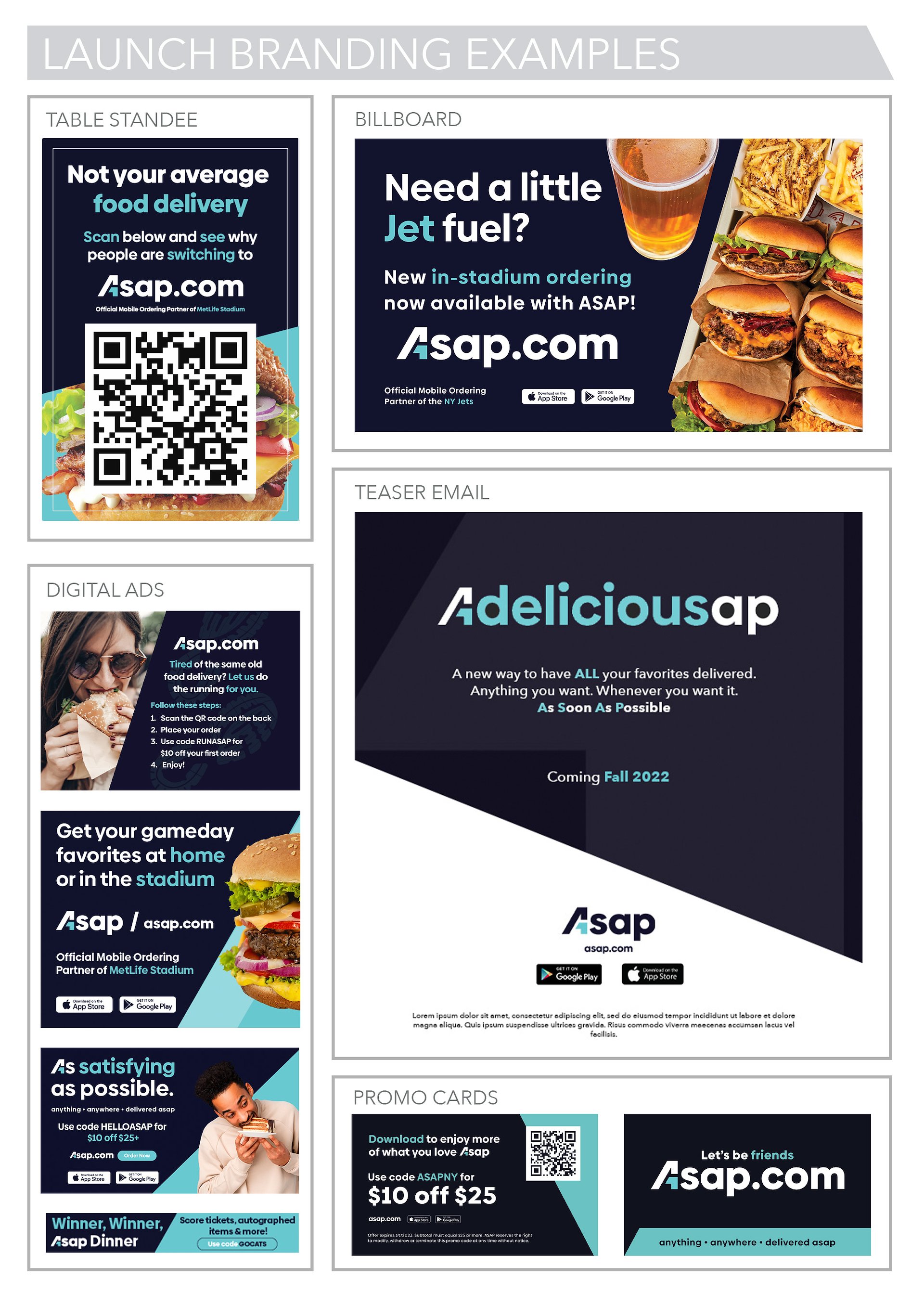
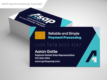
In early 2022 I was brought into a growing business that was looking to rebrand its main food delivery businesses, several business acquisitions, and it's growing B2B support systems under one larger umbrella company name. The new brand, ASAP, needed to have a strong identifiable look but still be flexible enough to be applied to widely varying businesses types and demographics. Initially brought in as a Rebrand Design Consultant, I joined the team on a long term basis as their Senior Designer, collaborating with designers Alyssa Shoults and Bryan Waterman in the development of the ASAP brand.

Logo Development


It was decided early on to make the “A" portion of ASAP be able to stand alone as a brand mark or be used as part of the brand name in the full logo, as was the concept of representing the meaning of "ASAP” (an acronym for “As Soon As Possible”) through creating some sense of moment or energy in the logo. Leadership was also very receptive to the of the use of some form of Iconography incorporated within the brand mark – arrows and “map location pins” being stand out favorites among the CEO’s.


Ultimately it was the sense of momentum and upward mobility (as the company was set to continue to grow) created through a slanted “A” and the use an arrow like shape in the lower right of the brand mark that won over the client. A final touch of making the arrow piece a different color to stand out was the winning combination for the client.

Brand Colors


In order to reflect the ASAP brand having multiple business verticals we chose to have a broad color palette and utilize the arrow portion of the logo as a way of differentiating each sub brand with an associated sub color, while leaving the Cyan/Aqua blue as the overall ASAP brands (now referred to as ASAP.com) primary color. We selected a dark navy as our brand wide “dark” or background color as it stood out just a touch from the more commonly used black, and it helped “pop” the selected brand colors and appear more vibrant.

Brand Identity


Allowing for flexibility and as little “rules” as possible was our goal with the branding visuals. The company was on a growth curve and the visual identity needed to be able to accommodate a growing array of business verticals and product types. As such we kept it simple – use the logo as our “guide” and incorporate angles whenever possible.


For the initial launch window of 3 months, we kept the color palette more restricted – and limited to dark blueish backgrounds with white text and using the cyan blue to make elements pop.


After the brand was established – who ASAP is and what ASAP does – we began to open up the limited palette we started with and began incorporating the other varied colors. As our main business at the start was still “food delivery” we also allowed for more varied ways of presenting food photography.

Header for email teasing ASAP’s 2022 Christmas promo

Header for one of the emails promoting ASAP's 2022 Christmas promo, where each day there was a new "prize" to be entered to win by ordering food and using the promo code.